THERE'S a huge mistake you're probably making in your home and it's making the entire space look weird and cheap.
But don't worry – it's a really simple fix and once you spot it you'll see it everywhere.
![]()

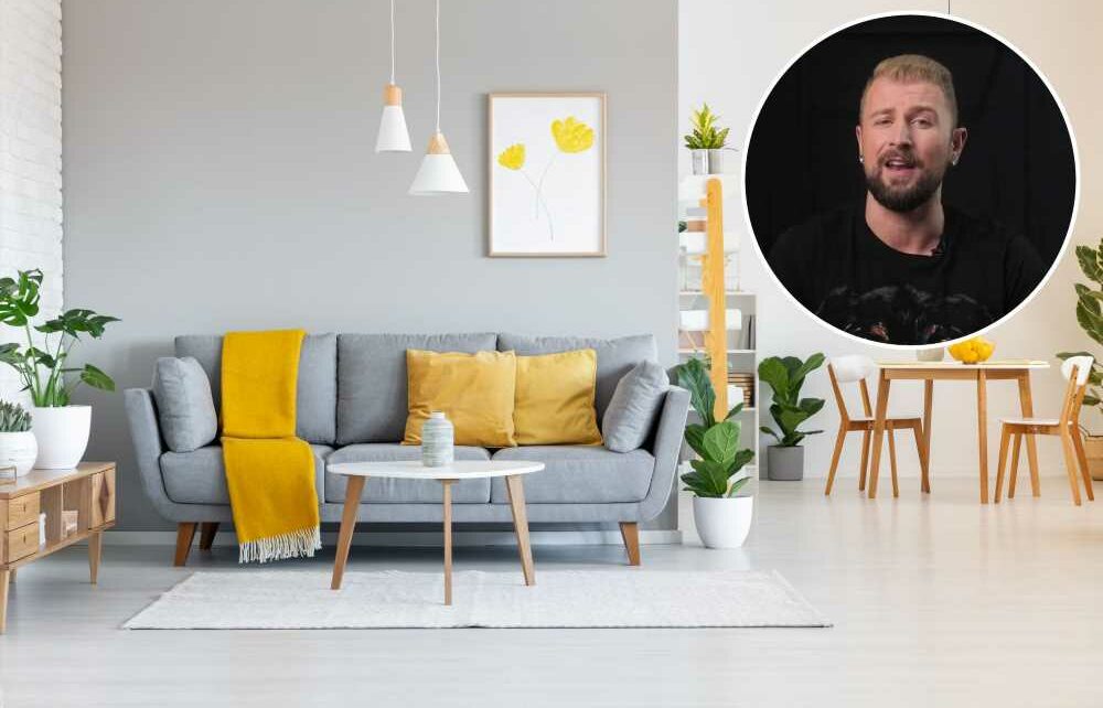
Interior designer Phoenix Grey took to TikTok to explain why adding a small pop of colour is a recipe for disaster and what you can do instead.
The problem is a lot of people want to keep the main elements of their home a neutral colour so it's easier to sell or redecorate down the line.
But to counteract all that cream, grey and beige they then feel the need to add in random pops of colour elsewhere.
Phoenix explained: "While this approach can be effective when done thoughtfully it really results in a design that feels disconnected or out of place, like a random yellow throw pillow in the living room that doesn't go with absolutelyanything."
READ MORE ON HOMES

I painted my stairs black like the TikTok trend – it’s the worst DIY idea ever

There’s a popular home trend that’s OVER – it’s making your home look tacky
Adding in this random pop of colour might seem like you're bringing some life into the space, but it's actually a dead giveaway that you don't know what you're doing.
"Introducing a bold colour without considering the existing colour pallet can lead to clashing and can create a really unpleasant visual experience," the pro added.
Not only that, but the random pops of colours can draw unwanted attention to the wrong parts of your home and overshadow other design elements.
So, what should you do instead?
Most read in Fabulous
 MYSTIC MEG
A stability moon means friends & family harmony can happen faster than you think
 STILL IN OUR HEARTS
King releases portrait of late Queen to mark one year since her death
 MISS YOU MAJ
I photographed the Queen for four decades – I’ll never forget the day she died
 TOP OF M&S DROP
I’m a fashion expert… here are 10 must-have buys from M&S’ autumn range
According to Phoenix, you should be more strategic with where you place bright colours.
If it doesn't enhance the overall look of the room it's probably not worth adding it to your space.
"Consider a focal point or area where the colour naturally draws attention.
"There are so many colour options to complement the existing colour pallet of a room to create harmony rather than clashing with it," the pro noted.
A good was to do this is going for a colour "a shade or two lighter or darker than the dominant pallet."
This will make sure everything blends together seamlessly without creating a disjointed feeling.
After sharing his top tip on social media homeowners shared some clever ways they added pops of colour to their homes.
One said: "Mycolours are on the more neutral side so I use by blue couch as my pop."
Read More on The Sun

Fans convinced Kanye’s wife is pregnant after spotting clue in Italy

Molly Marsh praised for revealing ‘real body’ secret not shown on Love Island
A second mused: "My overall colour pallet is white, dark grey and black, so my pop of mauve is ok right?"
Phoenix replied: "Yes that works because you keep it along a pallet that's consistent with a similar undertone."


Source: Read Full Article